Bella Union®
Bella Union® is a renowned sweetener brand based in Uruguay. It owes its name to the city of the same name, located in the far north of Uruguay, very close to Brazil.
Its agro-industrial complex is one of the main drivers of the region's economy.
To define the brand's new visual identity, we replaced the logo's typography, incorporating a sans-serif font, and redesigned the isotype, conveying the sensation of an "embrace" with clearer, more open lines.
The palette is associated with the colors of the Uruguayan flag, reinforcing the identification with the country's products. We strive to maintain simplicity, using a sober and modern aesthetic.


Before / After
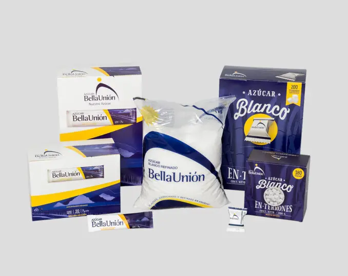
This is what the previous packaging looked like
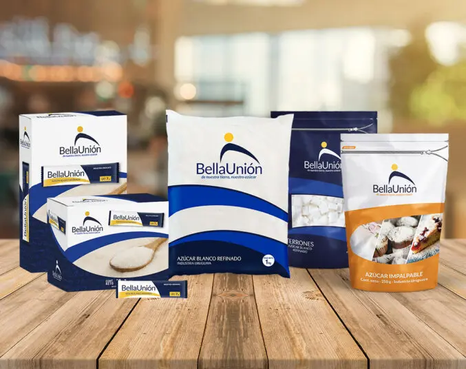
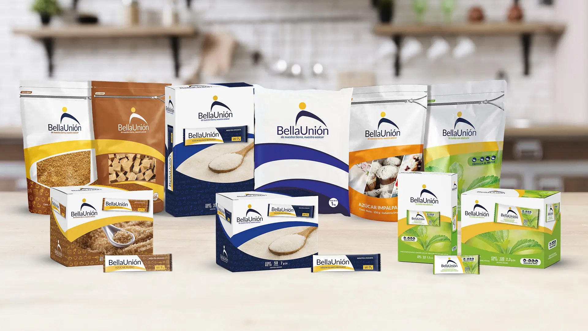
This is what the redesigned packaging looks like
The sweetener packaging, in all its forms, was redesigned according to the new aesthetic criteria. Also, and in line with the change in graphic identity, we have designed flyers, posters, brochures, supermarket hangers, animations, social media boards, street signage, road signs, and other promotional items.

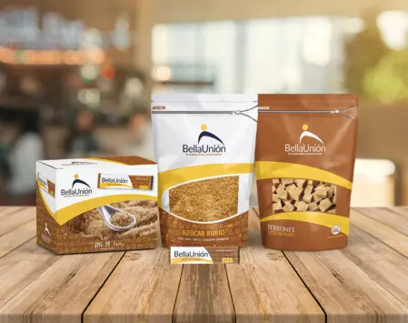

We have also collaborated with art direction, photography, filming, and video editing to promote the national production of brown sugar.
