There is a belief deeply rooted in many organizations — especially large ones — that when a brand already has a consolidated presence in the market, design is a solved matter.
The brand exists. The product sells. Consumers recognize it. Why change something that works?
The case of Azúcar Bella Unión is a good example of why that logic can become a trap.
The Starting Point
In 2018, ALUR’s marketing team approached us with a specific request: to redesign the Azúcar Bella Unión logo and improve the packaging for white sugar and brown sugar. Both looked outdated and had serious legibility issues. For a brand with a strong presence in the Uruguayan market, the image was not living up to the product.
The brief was limited. The solution, apparently, was too.
But when we sat down to analyze the problem in depth, we found something different.
The logo was not responsive — it had details that made correct reproduction almost impossible across different surfaces and formats. The packaging of the different products did not seem to belong to the same family. There were no shared visual criteria between product lines, nor an architecture capable of unifying them. And the brand, as a system, did not exist.
Bella Unión was a brand with decades of presence in Uruguay — made with sugarcane grown in Artigas, with all the symbolic weight that implies — but without a visual identity that matched what it represented.
The Real Diagnosis
There is an important difference between a logo that looks bad and a brand that has no identity.
The first is an execution problem. It can be solved with a specific redesign. The second is a structural problem: without shared visual criteria, each new product, each new communication piece, each new application of the logo on a different format produces an inconsistent result. The brand becomes fragmented. Consumers recognize it out of habit, not because of coherence.
In Bella Unión’s case, the problem was the second one. Redesigning two packages would have produced two better packages — while the rest of the line would have continued without a system.
What we proposed to ALUR was to go beyond the brief.
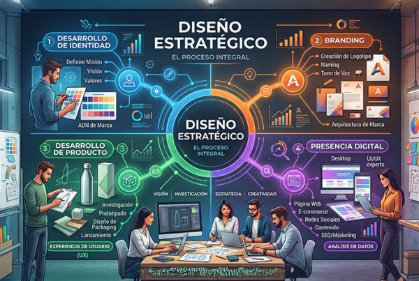
The right path was to build the brand identity from the ground up: a new logo designed with criteria of versatility and responsiveness, and a visual architecture that could work as a system for the entire product family. Only from there did it make sense to develop the packaging graphics.
The Scope of the Project
Once we were aligned on the strategic approach, the project unfolded in its full dimension.
Brand identity: a new Bella Unión logo, designed with scalability and versatility criteria to work correctly on any surface, size, and reproduction method.
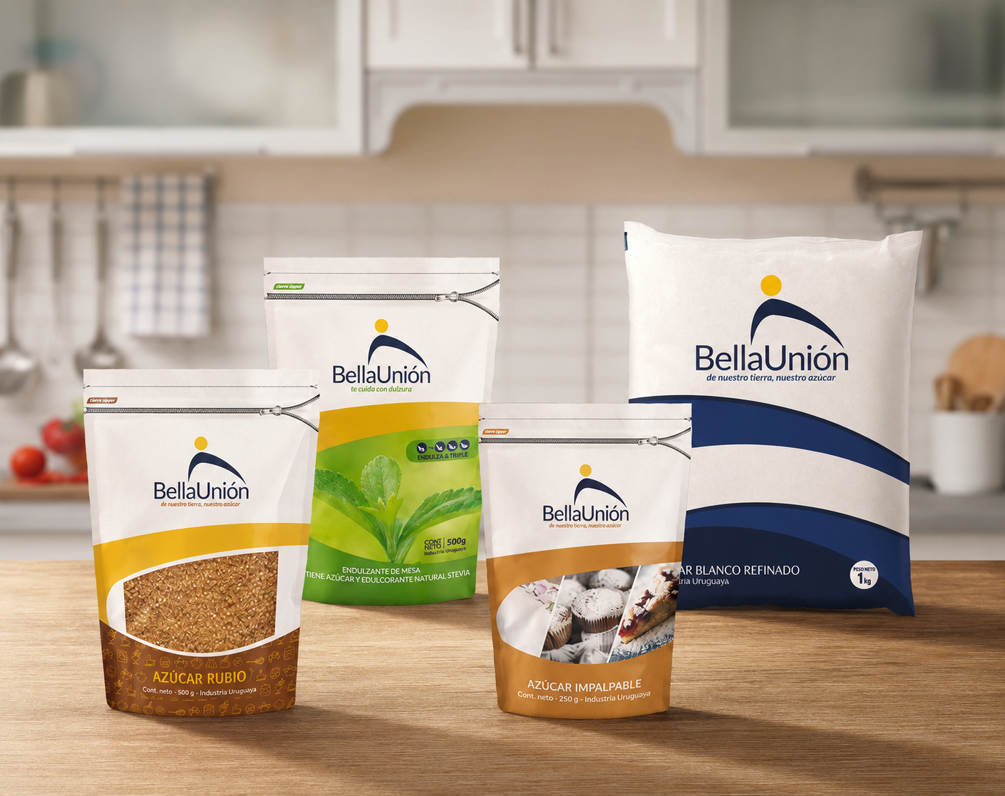
Packaging system: complete graphic development for the entire product line — White Sugar, Brown Sugar, Stevia Sweetener, and Powdered Sugar — across all existing formats: sticks, sugar cubes, display boxes, doypacks, and transparent bags. For the first time, Bella Unión’s products became a coherent visual family.
Point of sale: for the renewal to have a real impact in the market, it had to reach the place where purchase decisions are made. We designed POP materials for supermarkets and grocery stores, brochures, physical and digital recipe booklets, and shelf displays where the products would coexist with the competition.
Audiovisual communication: we filmed, edited, and produced a video about the brown sugar production process — showing the product’s artisanal and industrial origins — and developed motion graphics for the line’s digital communication.
The renewal was completed in 2019. It is the identity Bella Unión still uses today.
The Market Result
Since the 2019 renewal, Bella Unión has consolidated its position as one of the two leading brands in Uruguay’s domestic sugar market. Together with Azucarlito, both brands account for between 80% and 90% of total household consumption in Uruguay.
It is not possible — nor would it be honest — to attribute that result solely to design. A brand’s leadership in a mass market is the result of many variables: product quality, distribution, price, communication, and competitive context. Design is one of them.
But I do believe there is something this case clearly illustrates: a brand with a strong and coherent identity competes differently from one without it. It occupies visual space on the shelf more effectively. It builds greater trust at first contact. It creates recognition cumulatively across every point of contact with the consumer.
Bella Unión is a brand present in almost every Uruguayan household. In the pantry, on the table, in the kitchen. That level of everyday presence means that visual identity is not a detail — it is the language through which the brand speaks every day to millions of people.
What Mass-Market Brands Can Learn
The Bella Unión case offers a lesson that applies beyond sector or company size.
Brands with history tend to underestimate the cost of fragmented identity. When a brand has been in the market for decades, the recognition it has built can mask structural problems in its visual system — problems that may not be noticeable in the short term but gradually erode brand coherence over time.
An identity without a system does not scale. It works as long as the product line is small and the number of applications is limited. But when the company grows, when new products, new formats, and new communication channels appear, the absence of shared criteria becomes increasingly costly.
Investment in strategic design is not only aesthetic. It is the decision to build a visual platform capable of supporting the brand’s growth with coherence — today and in the years to come.
Has your brand been present in the market for years, but its identity has grown in a fragmented way? At CAPUT, we work on identity renewal with a strategic approach, without losing what the brand has already built.