Not everything that is designed is meant to last.
A commemorative logo is, by definition, ephemeral. It is born with an expiration date built in: it accompanies an anniversary, a celebration, an institutional milestone — and then it disappears. This could lead one to think of it as a minor piece of work, almost decorative. A commission to be resolved quickly and archived.
We believe the opposite. And the case of ALUR’s 20th anniversary is a good example of why.
The Starting Point
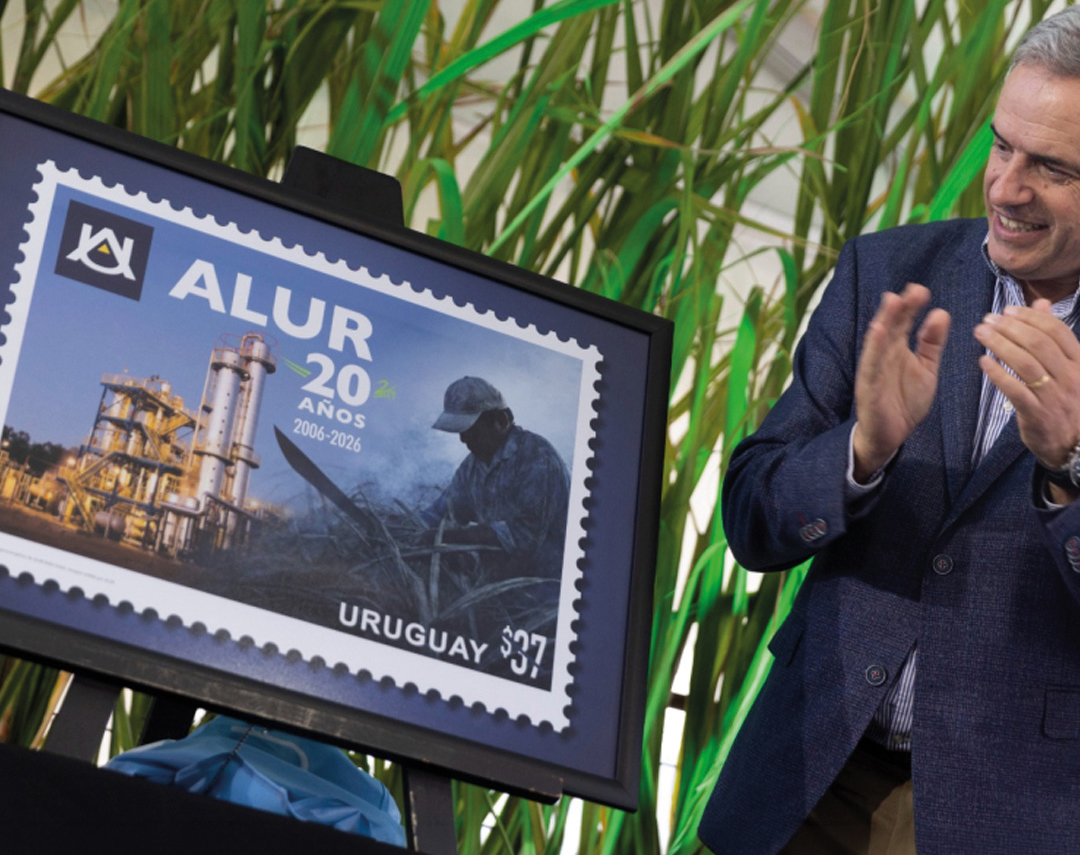
ALUR is celebrating 20 years. It is a state-owned agro-industrial company with deep roots in Bella Unión, Artigas, where sugarcane is not just a raw material: it is territory, a productive chain, and a symbol of regional development. A company that, over two decades, has built a strong presence in the Uruguayan market with brands such as Bella Unión — today one of the leaders in the sugar and sweeteners segment.
When we were invited to design the commemorative logo for its two decades, the brief included a specific requirement that made it more interesting than a conventional anniversary assignment.
The new logo could not “compete” with ALUR’s institutional brand. It had to enhance it. It had to coexist with it in a horizontal lockup without taking away its prominence. It had to adapt to multiple applications — from a pin to a roadside billboard. And at the same time, it had to tell a story of origin. Not only celebrate 20 years, but also express where ALUR comes from and what it represents.
A number set in a beautiful typeface was not enough.
The Trap of the Commemorative Logo
There is a common trap in this type of project: the temptation to solve the anniversary as a generic seal. Number + typography + some graphic element from the parent brand. It works. It is safe. And it is completely forgettable.
The problem is not aesthetic — it is strategic. A commemorative logo that says nothing beyond the number loses the opportunity to reinforce what the brand has already built. It is presence without argument.
In ALUR’s case, that opportunity was clear: the company has a very concrete productive identity — sugarcane, the territory of Artigas, the agro-industrial chain — which rarely appears explicitly in its visual communication. The anniversary was the ideal moment for that identity to take shape.
The Design Process
We worked through successive iterations, starting from more institutional and typographic proposals — exploring symmetrical compositions, horizontal and vertical versions, and anniversary seal concepts — until arriving at the final synthesis.
The central decision was to build the “20” as a recognizable icon with its own logic, capable of working in a lockup alongside the ALUR logo without competing with it. A “20” that could be read as a form before being read as a number.
And within that form, we incorporated sugarcane.
Not as a literal illustration — but as a mark of identity. A direct nod to what ALUR is and where it comes from, integrated into the structure of the number in a way that added movement and depth without compromising legibility. The “20” communicates the celebration. The sugarcane communicates the roots.
That duality — number and productive identity within a single form — became the argument that defined the final result.

The Technical Challenge: From a Pin to a Roadside Billboard
A commemorative logo does not live in a single format. It lives across the company’s entire communication ecosystem during the anniversary period: institutional stationery, product packaging, large-format signage, internal merchandising, and digital communication.
This creates a technical challenge that is not always anticipated: the same identity must work from the smallest possible size to the largest imaginable scale. From a lapel pin to a roadside billboard.
To solve this, designing the logo is not enough — it requires developing a complete system of technical versions according to format and application:
A gold seal for premium applications on product packaging — communicating celebration and value without losing coherence with the existing packaging.
A three-ink version for internal merchandising, with precise specifications for the production of a custom pin.
A set of technical versions according to reproduction method — digital, offset printing, screen printing, vinyl — to ensure visual consistency in every context where the logo will appear.
In this type of project, technical systematization is just as important as the conceptual work. A commemorative logo that looks good on screen but loses legibility in embroidery or low-budget printing has not fulfilled its purpose.
What the Ephemeral Teaches Us About Design
There is something these projects reveal very clearly: the rigor required by ephemeral work is no less than that required by permanent work.
Sometimes it is greater.
Precisely because it has only one opportunity to communicate — a limited period, a specific context, an audience that will not have time to “learn” how to read the identity — every design decision has to work immediately. There is no iteration with the market. There is no time for the consumer to get used to it. Either it communicates on first contact, or it does not communicate at all.
This demands conceptual clarity, technical precision, and an application system considered from the very beginning. Exactly the same as any permanent identity project.
The difference between a well-resolved commemorative logo and a generic one does not lie in the budget or the time invested. It lies in whether someone asked, before opening the file, what that logo needs to say — and why it is worth saying.
Is your company or brand going through a moment of celebration, transition, or institutional milestone?
At CAPUT, we approach commemorative identity design with the same strategic rigor as any brand project. Let’s talk.