Some brands don’t belong to companies. They belong to the people.
Vascolet is one of them. Since the 1950s, it has been a staple of the Uruguayan merienda. It’s not just a brand of chocolate powder—it’s a cultural code shared across generations. The mug, the character on the bicycle, the red block visible from the other end of the supermarket aisle. There are elements of Vascolet that consumers feel are theirs, even if they never consciously chose them.
When Nestlé Uruguay invited us to design the packaging for a limited edition Dulce de Leche flavor, our first realization was clear: we weren’t just designing a pack. We were intervening in something that lives in the emotional memory of an entire country.
The Untouchables
Before making any design decisions, you must understand what makes a brand recognizable. Not what the company thinks it is—but what actually acts as a signal in the consumer’s mind.
In the case of Vascolet, those assets are unmistakable: the red block at the top of the pack, the bold typographic logo, the iconic character—”Alejandro Vascolet”—and the playful, energetic tone that connects with childhood, play, and movement.
You don’t touch those elements. They are the bond between the brand and the buyer. Breaking them, even partially, means walking away from decades of built-in recognition.
The challenge wasn’t to replace them. It was to coexist with them while introducing something completely new.
What the Pack Had to Say
A flavor extension has a specific responsibility on the shelf: it has to communicate the new flavor before anyone even reads the words. In two seconds, from three feet away, the consumer must understand that this is different from what they already know—and they have to want it.
You don’t solve that with text. You solve it with a visual system.
In this case, the challenge had an extra layer: dulce de leche isn’t just a flavor. In Uruguay, it’s a cultural icon. It represents childhood, home baking, the afternoon mate, and a deeply rooted dairy culture. We had to honor that weight without falling into clichés.
How do you make a pack “say” dulce de leche before anyone reads the label?
The Design Decisions
The answer lay in building a dedicated visual world for this flavor—within the limits imposed by Vascolet, but with enough identity to stand out within the product line.
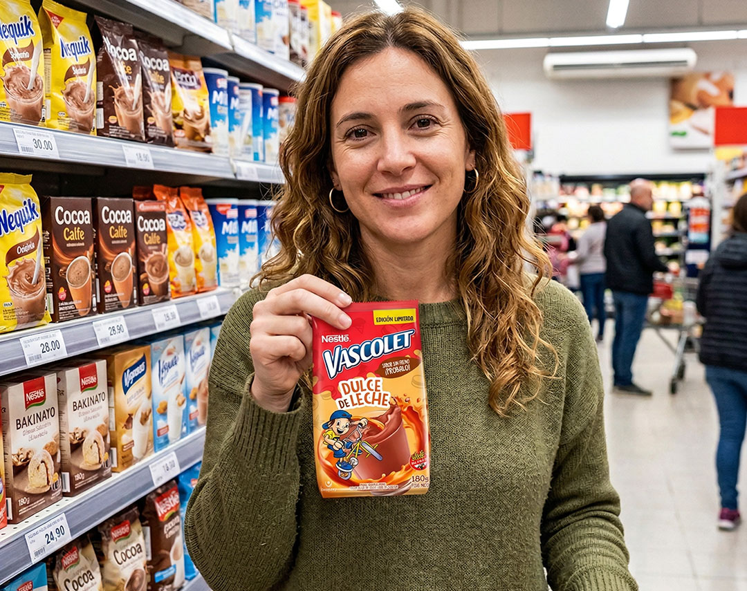
- The Palette: We replaced the cooler tones of the original pack with a warm palette of golds, creams, and caramels. Color is the first message the eye receives. Before reading “dulce de leche,” the consumer already feels it through the visual temperature of the packaging.
- The Key Visual: We developed a “high-appetite” scene where chocolate and dulce de leche swirl together—a dynamic splash that anticipates the taste experience. The viscosity, the texture, the color of the caramel blending with the chocolate: everything was designed to make the mouth react before the mind does.
- The Character: “Alejandro Vascolet”—the brand’s iconic character—was integrated into this new scene without losing his essence. He is still the same: energetic, playful, in motion. But now he inhabits a caramel universe that reinforces the new flavor without losing his protagonism or consistency with the rest of the line.
Each of these decisions has a strategic justification. There are no decorative elements on this pack.
Lessons from Heritage Brands
Working with a brand that has decades of history teaches you something that isn’t always obvious: design cannot be limited to “updating” or “beautifying.” It must understand what must stay, what can evolve, and what needs to stand out for the product to perform at the point of sale.
This requires reading the brand ecosystem before opening a single design file. You must understand the existing visual architecture, the untouchable codes, and the tension between innovation and recognition. Only then can you chart a creative direction that is both strategically sound and aesthetically grounded.
In packaging, the purchase decision happens in seconds. The consumer doesn’t read—they scan. If the pack doesn’t communicate the essentials in that first glance, everything else is too late.
The Result
Vascolet Dulce de Leche was an exercise in balancing memory and innovation. A limited edition that unites two icons of Uruguayan childhood—chocolate milk and dulce de leche—into a single pack that can be “read” in a second.
The result is packaging that works on the shelf, in digital communication, and in campaigns—because it was designed as a system, not an isolated piece.
Packaging as Your First Salesperson
There’s a phrase we use a lot at CAPUT: packaging is the product’s first salesperson. When it doesn’t do its job, everything else becomes harder—communication investment, shelf visibility, and building brand preference.
When it does its job well, it works on its own.
Packaging design isn’t decoration. It is strategy applied to an object. And when working with historic brands, that strategy always starts with the same question: What is the one thing we cannot afford to lose?
Do you have a launch in progress or a product that needs to stand out on the shelf? At CAPUT, we work with marketing teams that need a strategic design partner, not just an executor. Let’s talk.