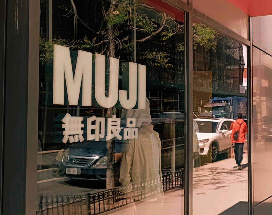
*MUJI is a Japanese brand founded in 1980, recognized for its philosophy of simple, functional design free from visual excess. Its name comes from Mujirushi Ryohin, which can be translated as “no-brand quality goods.” Through everyday objects, minimalist packaging, and calm, orderly shopping experiences, the brand has built an identity rooted in clarity, simplicity, and usefulness rather than visual impact.
Twenty years ago, not having a TV at home was seen as unusual, a sign of financial struggle, or even eccentric. Keeping it on in the living room, kitchen, or bedroom was said to “bring life” into the house, even when no one was really paying attention to it.
A waiting room with a television felt modern. In some buses, it still feels like a symbol of innovation. Depending on the model, it could even signal a certain social status.
Something similar is happening today with our phones.
Have we stopped enjoying silence?
Do we constantly need to fill every empty space?
The sense of exhaustion many of us feel today has led us to seek quiet getaways, disconnected places, spas, or even spiritual retreats. We need to escape, even if only for a moment, from the everyday noise constantly surrounding us.
A noise created by screens, notifications, stimuli, and messages endlessly competing for our attention. Spaces that, many times, we continue feeding out of habit ourselves.
We are beginning to value things that once seemed boring: calm, empty spaces, soft music, simple experiences.
And perhaps it’s no coincidence that many brands are beginning to reflect this growing need for calm, clarity, and more human experiences.
During my last visit to New York, I walked into MUJI* and Glossier**, two completely different brands that nevertheless seem to have understood something about the moment we are living through.
Neither needs to shout to get attention.
One through calm.
The other through fluidity and belonging.
At MUJI, I felt something unusual: the desire to stay without feeling the need to buy anything.
The moment I stepped inside, I slowed down. The absence of visual noise, the clarity, and the ease of understanding each product created a sense of calm.
There was a huge variety of objects, yet none of them seemed to shout “buy me” or “donʼt miss this deal.”
That feeling didnʼt come only from the products themselves. The staff were busy organizing, arranging, or working quietly in their spaces, without anxious or insistent looks.
For a moment, the store felt like a pause within the fast rhythm of the city.

In contrast, Glossier felt glamorous and futuristic, with the aesthetic and precision of a laboratory, yet warm and approachable at the same time.
The experience invites you to discover what each product does through extreme visual clarity. Everything is arranged to let you touch, try, and explore without interruption.
The staff offer guidance if you need it, but without invading your space. The feeling is that you are the one gradually discovering what works for you.
Even the products on sale are marked with a discreet “SALE” sign that only appears once you stop and look closely at what you were already searching for.

**Glossier is an American beauty brand founded in 2014, known for transforming makeup and skincare into an approachable, intuitive, and highly visual experience. Its proposal combines a futuristic minimalist aesthetic with spaces designed to explore, test, and discover products freely, prioritizing user experience over traditional intrusive selling.
Design May Be Looking for Something More Than Attention
It begins to seek clarity, well-being, sincerity, and naturalness.
Maybe the future will not look so much like the idea of screens, constant stimulation, and visual overload that we imagined decades ago.
Maybe it looks more like learning how to lower the volume.
To live better without noise. And also with ourselves.
–
Andrea Rodríguez
Art Director