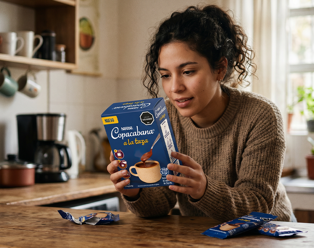
There are briefs that seem simple at first glance, but as you start to unpack them, they reveal layers of complexity. The Copacabana “a la taza” (Drinking Chocolate) brief was one of them.
Initially, the task seemed straightforward: design the packaging for a new Nestlé Uruguay product under the Copacabana brand. This is a brand with decades of history in the Uruguayan market—a warm, familiar, and highly recognized identity. It’s the kind of project where one might think the path is already paved.
However, as we dove deeper into the brief, the challenge became much more than just adding another pack to the line.
The Real Problem: A New Format, Not Just a New Flavor
There is a fundamental difference between launching a flavor extension and launching a completely new format. With the former, the consumer already knows what the product is—they just need to understand how this one is different. With the latter, you have to communicate something much harder: what the product is, how to use it, and what experience it creates.
Copacabana “a la taza” was the latter. An individual sachet of chocolate designed for drinking, offering a consumption experience entirely different from the chocolate people already associated with the brand. It wasn’t a variant; it was a new ritual.
How do you communicate that at a single glance from the supermarket shelf?
The packaging had to solve several things simultaneously: the nature of the product, the preparation method, and the final result—all while maintaining Copacabana’s warm, familiar identity without falling into generic tropes in an increasingly competitive category. A new format within a heritage brand cannot ignore either side of that equation.
Going Backward to Move Forward
When a brief is this complex, the easy route is to jump straight to an aesthetic solution—look for an appetizing image, choose warm colors, and propose something that “looks good” on the shelf.
We prefer to go further back.
Our first step was conceptual research. We didn’t just look at the hot beverage category or direct competitors; we looked at the very origin of drinking chocolate. We explored its history in Mesoamerican cultures, where cacao wasn’t just an ingredient but a ritual element with deep symbolic meaning. It’s a centuries-old practice that traveled from Central America to Europe and eventually became part of domestic culture across half the globe.
This research wasn’t meant to appear literally on the pack. No one is going to read the word “Mesoamerican” on a 25g sachet in a grocery aisle. But understanding where something comes from fundamentally changes how you tell its story visually. It gives the system depth. It provides a reason for being behind design decisions that go beyond mere aesthetic preference.
The Decisions That Define the Pack
From that research came the most important decision of the project: incorporating a texture inspired by Pre-Columbian patterns that runs across the packaging as a secondary graphic element.
It isn’t just decoration. It is a visual argument that connects the product to the historical roots of cacao—without the consumer needing to be consciously aware of it. It adds depth, character, and differentiation within the category that doesn’t rely on price or pack size. It’s the kind of detail that no one explicitly notices, but it makes the product feel “different” without people being able to explain exactly why.
The spoon was the other major decision. In a way, it was the most direct one.
The image of the spoon dipped into the chocolate—meticulously designed to represent the product’s actual viscosity—does the heavy lifting for the pack. It anticipates the experience before the sachet is even opened. It communicates temperature, texture, and the ritual of preparation. In one second. Without text. This is exactly what a new format needs on the shelf: an image that shows what you will experience when you use it, not just what you are buying.
On this foundation, the visual system maintains the familiarity of the Copacabana universe—its palette, its warmth, its tone—while introducing elements that give this specific format its own identity. The result is a pack that reads as “Copacabana” from a distance and communicates “drinking chocolate” before the customer even gets close enough to read the words.
Lessons from a New Format
Working on the launch of a new format within an established brand comes with its own rules—and its own traps.
- The Overconfidence Trap: Brands with history often rely too much on their brand equity, assuming consumers will understand a new product simply because the logo is on it. This doesn’t always work. Brand recognition gets you attention—the packaging has to do the rest.
- The Over-Differentiation Trap: The opposite mistake is breaking too sharply from the existing identity to differentiate the format, resulting in a product that no one associates with the parent brand. Recognition capital exists to be used, not ignored.
The “sweet spot”—which is the real work of strategic packaging design—lies in identifying which brand elements are untouchable, which can evolve to communicate the new format, and how to build a system that does both at once.
In the case of Copacabana “a la taza,” that balance was found in the Pre-Columbian texture that provides depth and history, and the spoon that communicates the experience. One speaks to the product’s past; the other speaks to its future in the consumer’s routine.
Packaging as a System, Not a Piece
One fact often overlooked in packaging design: the pack does not live in a vacuum. It lives surrounded by competitors on a shelf with dozens of simultaneous visual stimuli, and it also lives in digital communication, campaigns, and social media.
The visual system for Copacabana “a la taza” was designed to work across all these contexts with equal strength. The spoon, the texture, and the warm palette are scalable elements—they read just as clearly on the physical sachet as they do in a digital mockup or a point-of-sale display.
That is the standard we seek in every packaging project: design decisions solid enough to travel far beyond the physical object.